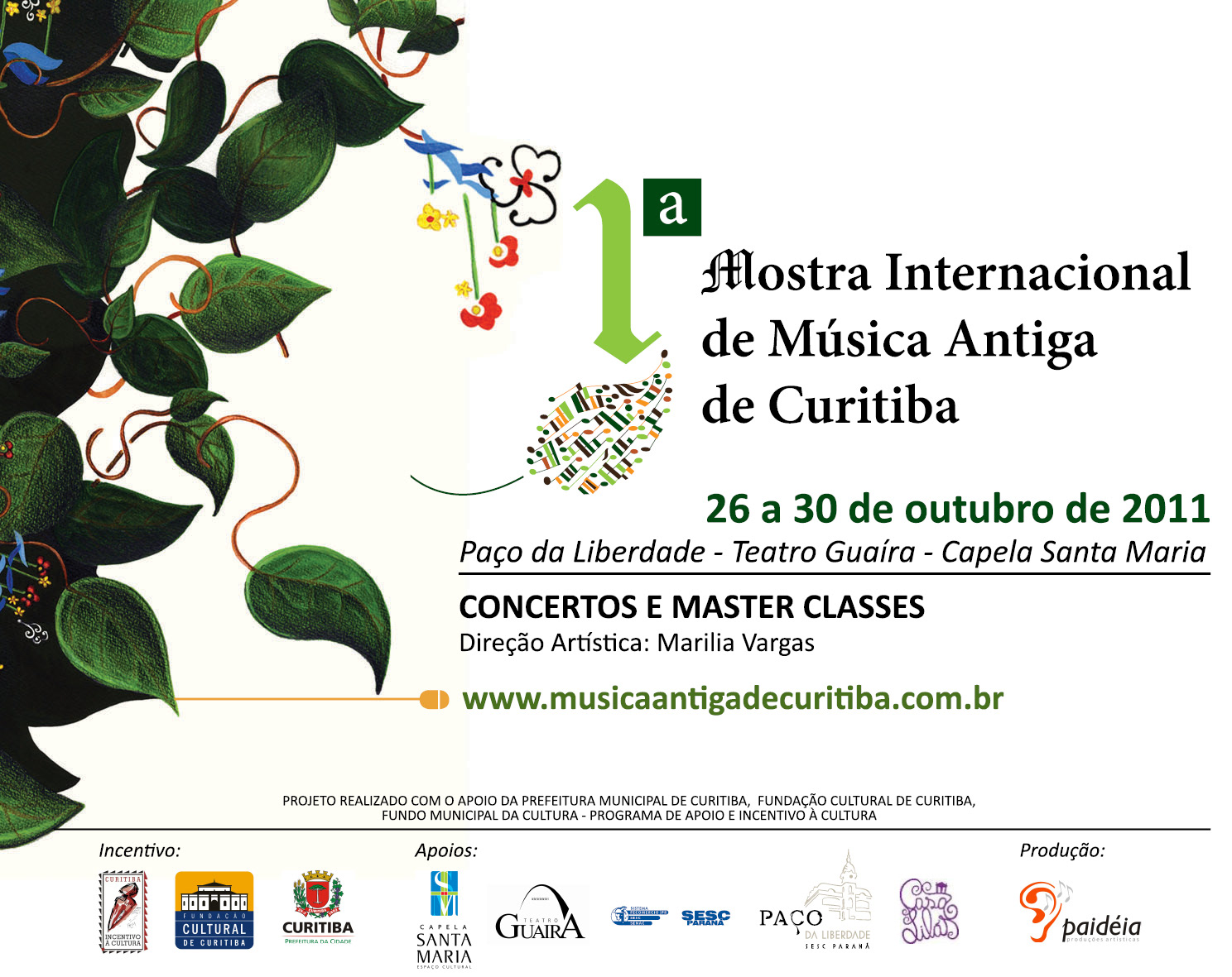
I International Festival of Ancient Music of Curitiba/Brazil (2011)
Visual Identity Design - logotype, poster, catalog, insert
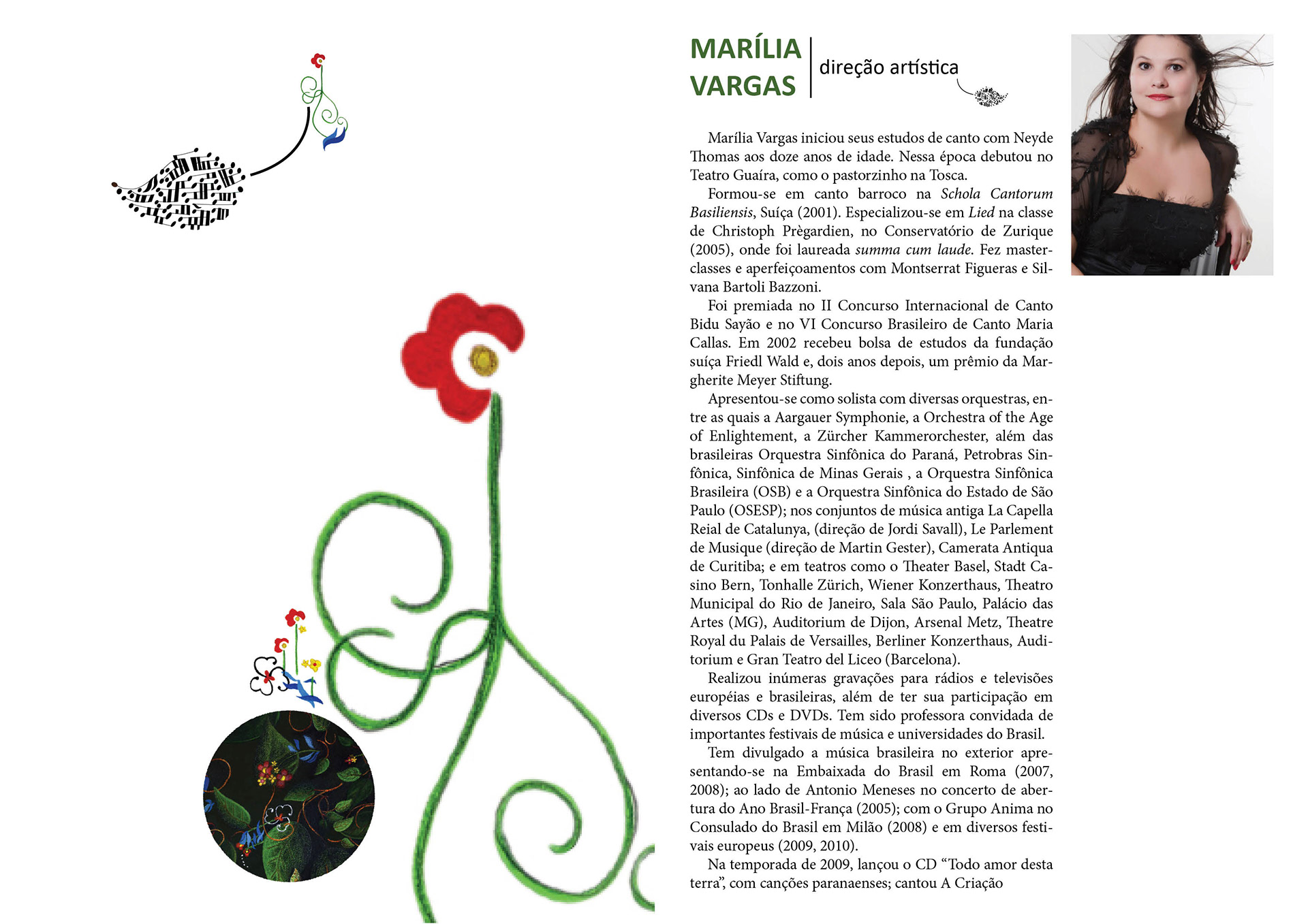
The concept of Ancient Music and the very repertory of the concerts of this festival center around the period known as Baroque. For this reason, even though I tred to avoid explicit references to its iconography, the allusions to a teorba and to the ogee of gothic cathedrals turn the attention of the audience to the message: Show/Festival of Ancient Music.
The reference to Curitiba city lies in the wooden houses built by the polish descendants of the city. Together with the gothic ogee, the message becomes ambiguous and reinforces the metaphor that Curitiba is culturally (due to its immigrants) very close to the three foreign countries represented in the concerts of this event: France, Germany and Italy.
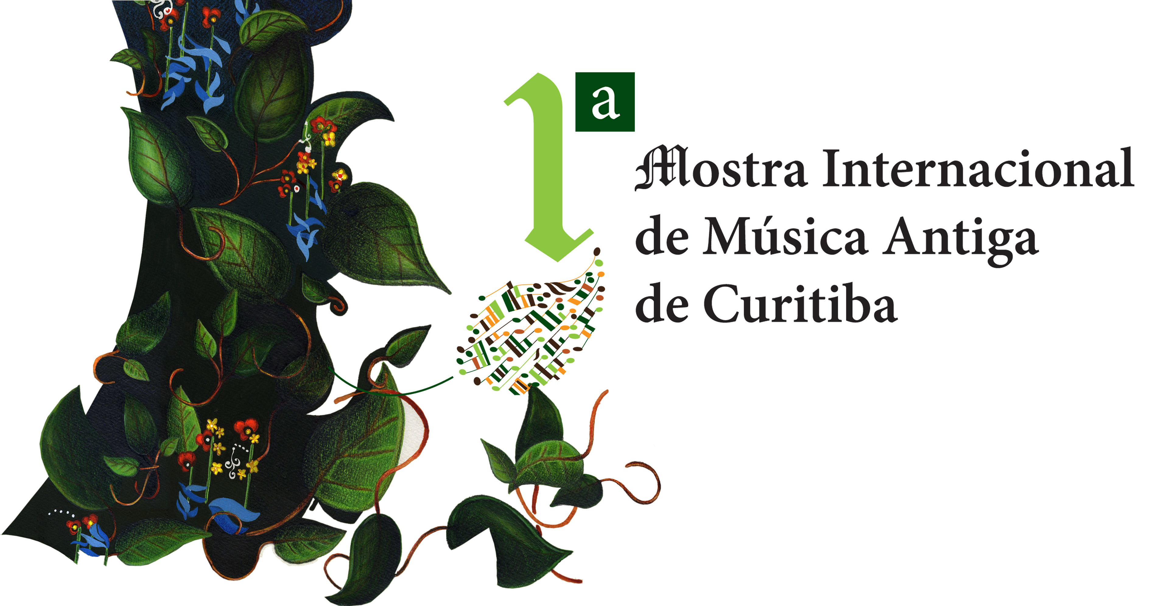
The illustration's main theme took references from the following ideas: "Naturlaut" (the sounds of Nature), the concept of "Garden of (musical) Delights" (by Hieronimous Bosch), the concept of "fugue" and the inspiration in the "theory of affection (I Affetti Musicali)".
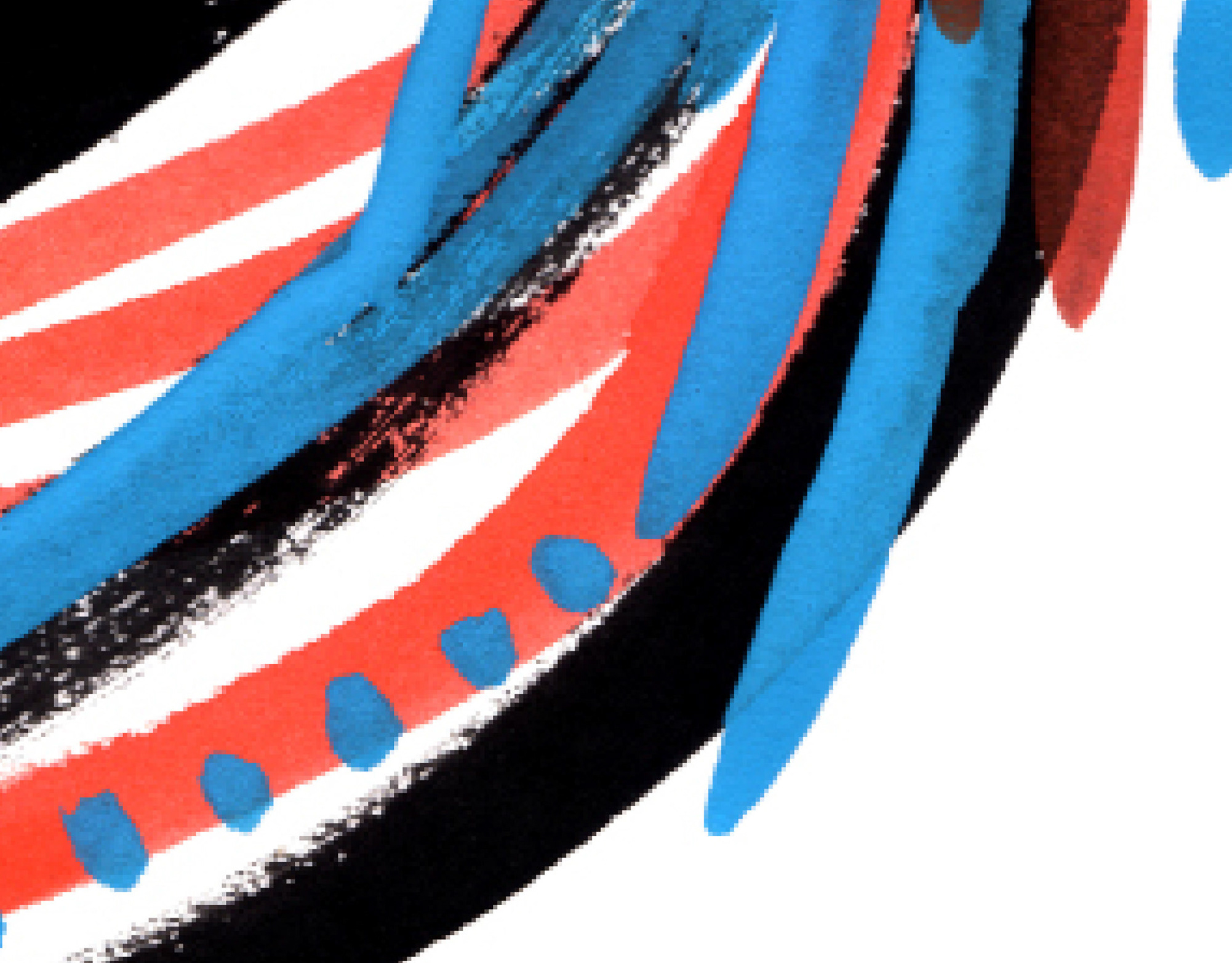
I attempted to represent the idea of "fugue", or "counterpoint" in the teorba's Rosetta, whose flowers are a stylisation of a quarter note. The idea of "sounds of Nature", inspired by Mahler's 6th Symphony, are represented in the green leaves, composed by musical notes that, visually, are metaphorically connect to the concepts of "nature x culture" and "music x visual". The other musical notes, represented in brown shades, are a play with the similarity between musical notes and a green field (this image comes from a certain pastoral image that evokes, in me, Vivaldi, Gregorio de Mattos and Bocaccio).
In the logotype, I tried to mix typographic families that made reference to ancient and modern atmospheres. The play with the typographic images is also a reference to Herb Lubalin, Saul Bass and Miran - graphic artists that, since the 1970's, have been deconstructing typographic elements.
The logo itself, represented as a leaf filled with notes, evokes the idea of "Naturlaut" and, as a consequence, baroque's philosophic thought, that places Man as part of Nature, in relation to God, to the Spiritual, and to the relation Sacred x Profane - without relying on further baroque iconography that, to me, is a cliche that should be avoided.
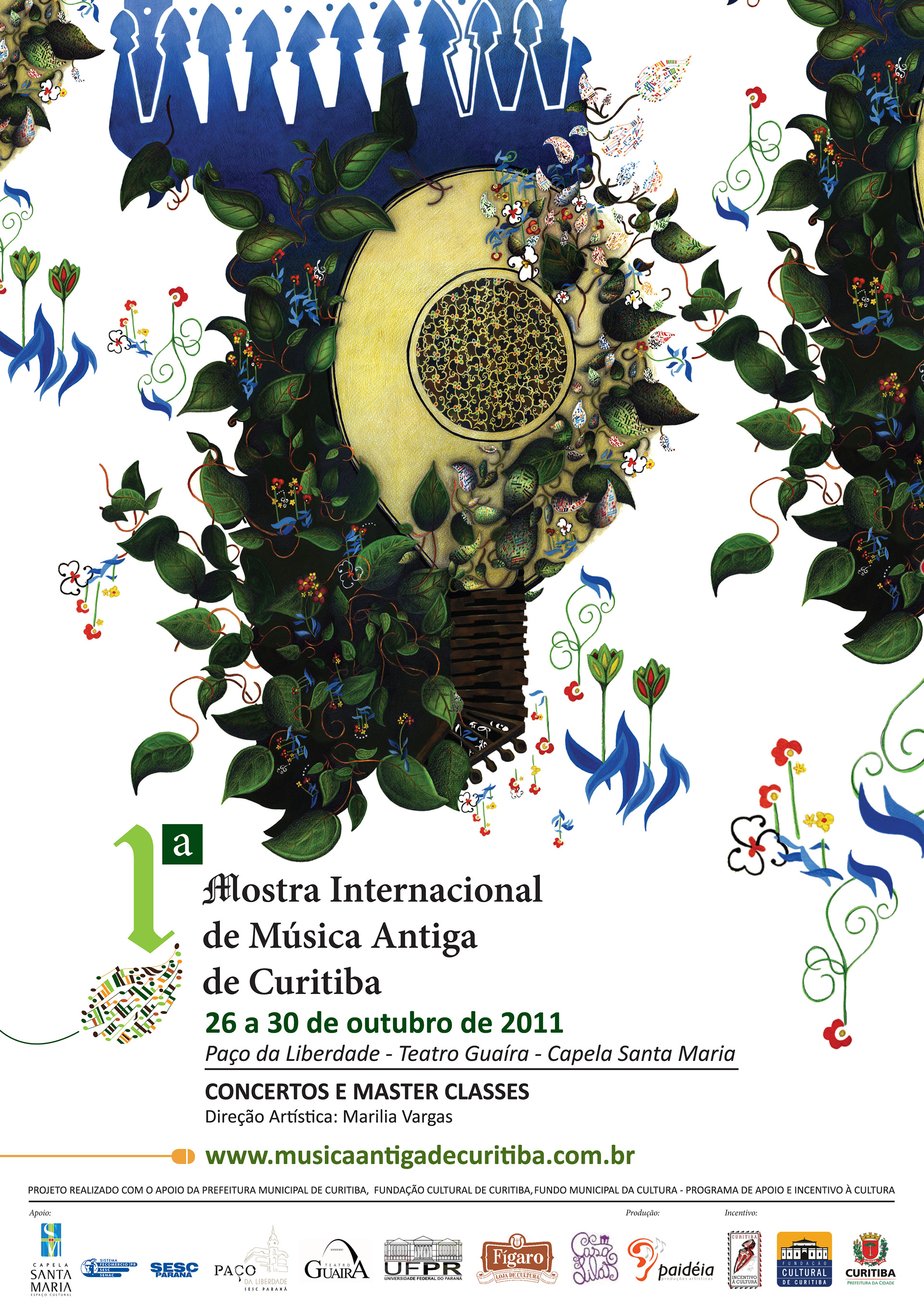
Poster (A3 size). Illustration: watercolour and coloured pencil on paper (c.90x70cm) with the layout composed in Photoshop and Illustrator
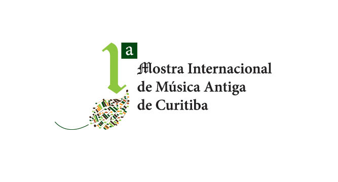
Logo
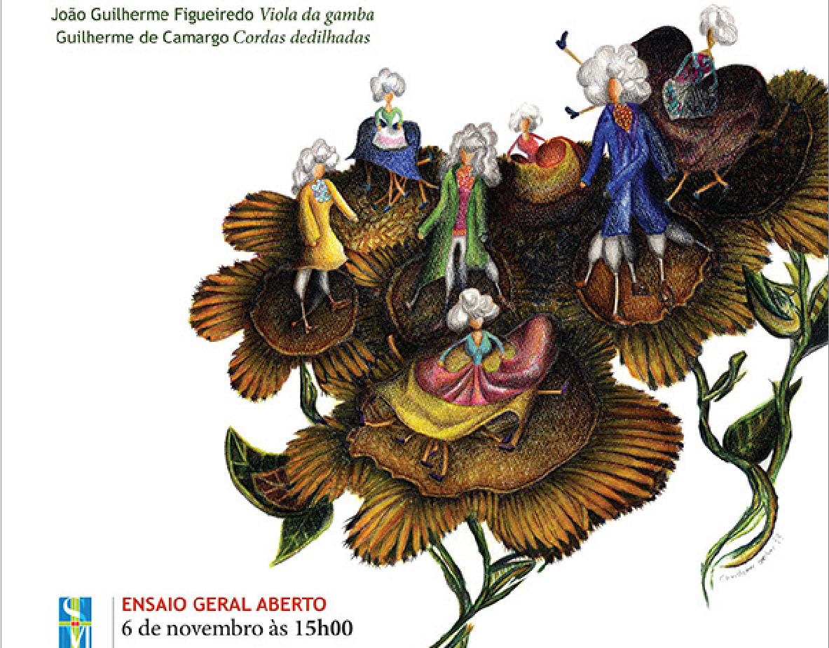
Detail (catalog)
Magazine insert (12.6 x 10cm)

Catalog
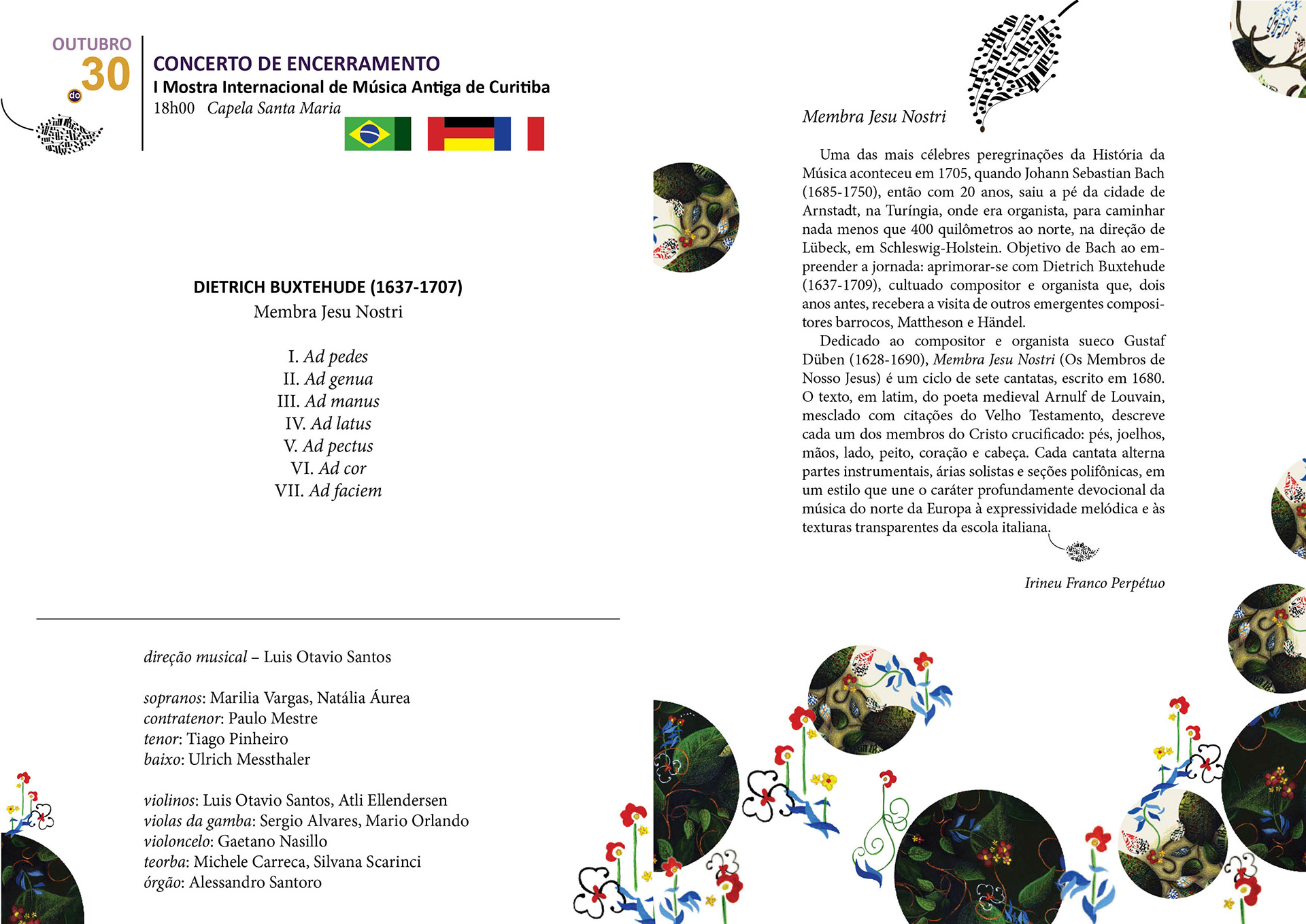
Catalog
Catalog